
Senior Product Designer | Absorb LMS
Senior Product Designer | Absorb LMS
Onboarding
Onboarding
Onboarding
AI-Design . Design Strategy . User Research . Visual Design
AI-Design . Design Strategy . User Research . Visual Design
Coming soon...
Skills
Skills
Skills
Growth Design . User Research . Design Vision
Growth Design . User Research . Design Vision
Coming soon...
Instructor-led
training
Instructor
-led
training
Instructor-led
training
Design Strategy . Product Thinking . User research . Visual Design
Design Strategy . Product Thinking . User research . Visual Design

Instructor-led training
Instructor-led training
Redesigning how learners discover, plan & manage live training to improve user participation & client retention
Redesigning how learners discover, plan & manage live training to improve user participation & client retention
Redesigning how learners discover, plan & manage live training to improve user participation & client retention
Project & Team
Improve Instructor-led/ Live training experience for LMS users
1 PM, 4 Developers,
2 Backend engineers
Improve Instructor-led/ Live training experience for LMS users
1 PM, 4 Developers,
2 Backend engineers
Improve Instructor-led/ Live training experience for LMS users
1 PM, 4 Developers,
2 Backend engineers
My Role & Duration
Design Lead
3 months
Design Lead
3 months
Design Lead
3 months
Scope & Impact
Used by
Used by
enterprise
enterprise
organizations delivering instructor-led training
organizations delivering instructor-led training
organizations delivering instructor-led training
Contributed to
Contributed to
increase in CSAT
increase in CSAT
increase in CSAT
Tools
Figma, Miro
Pendo
UserTesting (AI)
Gong (AI)
Figma, Miro
Pendo
UserTesting (AI)
Gong (AI)
Figma, Miro
Pendo
UserTesting (AI)
Gong (AI)
Overview
At Absorb LMS, I worked on rethinking the learner experience for Live or Instructor-led courses, which are a core part of how many organizations deliver training to their employees. The goal of this project was to help learners better discover upcoming training, understand session schedule, and manage live training more confidently in their workday.
I led the end-to-end design for the learner-facing experience, including problem framing, research synthesis, information architecture, interaction design and cross-functional alignment. The result was a more cohesive experience that helped learners discover and manage time-based training in one place, improving attendance, completion and overall confidence in navigating live training.
At Absorb LMS, I worked on rethinking the learner experience for Instructor-led courses, which are a core part of how many organizations deliver live training. The goal of this project was to help learners better discover upcoming sessions, understand recurrence schedule, and manage live training more confidently inside the flow of their workday.
I led the end-to-end product design for the learner-facing experience, including problem framing, research synthesis, information architecture, interaction design and cross-functional alignment. The result was a more cohesive experience that helped learners discover and manage time-based training in one place, improving attendance, completion and overall confidence in navigating live training.
Designed for tens of thousands of enterprise learners participating in live, instructor-led training on the LMS.
Designed for tens of thousands of enterprise learners participating in live, instructor-led training on the LMS.
Contributed to higher client satisfaction & retention across compliance-heavy organizations like healthcare, retail and manufacturing.
Contributed to higher client satisfaction & retention across compliance-heavy organizations like healthcare, retail and manufacturing.
Improved user workflows including onboarding, compliance and recurring certifications, reducing friction around session discovery, scheduling and attendance management.
Improved user workflows including onboarding, compliance and recurring certifications, reducing friction around session discovery, scheduling and attendance management.
Context
Managing learning that happens in real life
Managing learning that happens in real life
Managing learning that happens in real life
Most workplace learning doesn’t fail because people don’t care. It fails because real life gets in the way.
Most workplace learning doesn’t fail because people don’t care. It fails because real life gets in the way.
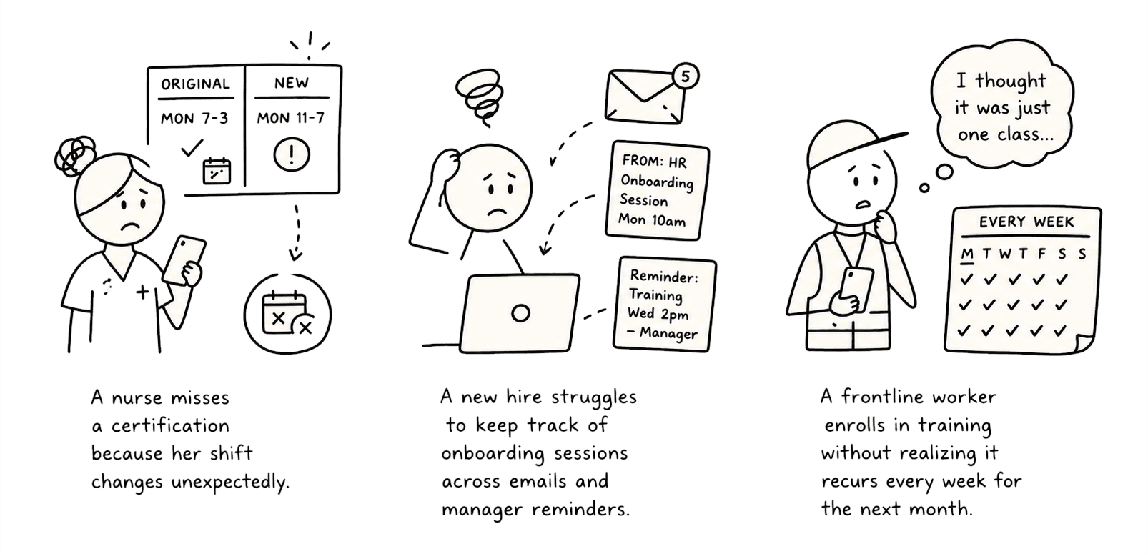
What is Instructor-led training (ILC)?
Instructor-led training are live, scheduled sessions led by an instructor, attended by multiple learners and one of the highest-stakes learning moments in enterprise environments.
In healthcare, retail, manufacturing and other compliance-heavy industries, missing a session can delay onboarding, increase risk and affect operational readiness.
What is Instructor-led training (ILC)?
Instructor-led training are live, scheduled sessions led by an instructor, attended by multiple learners and one of the highest-stakes learning moments in enterprise environments.
In healthcare, retail, manufacturing and other compliance-heavy industries, missing a session can delay onboarding, increase risk and affect operational readiness.
The problem
Understanding why the current experience was breaking down
Understanding why the current experience was breaking down
Summary
Due to the complex system of ILCs and lack of clear information, learners struggled to understand what to do next, where to find upcoming sessions and how to verify progress across courses, classes and skills. The Calendar flows lacked clear status, time context and preparation details, which caused missed sessions and last minute confusion. On mobile, key actions felt buried or incomplete, which reduced engagement during the moments learners most needed quick access.
Summary
Due to the complex system of ILCs and lack of clear information, learners struggled to understand what to do next, where to find upcoming sessions and how to verify progress across courses, classes and skills. The Calendar flows lacked clear status, time context and preparation details, which caused missed sessions and last minute confusion. On mobile, key actions felt buried or incomplete, which reduced engagement during the moments learners most needed quick access.

Auditing the current state
Organizations relied heavily on instructor-led training, yet the learner experience for managing it had not evolved with the complexity of how it was delivered, resulting in about 30% missed session attendance, incomplete courses and in many cases, compliance risks for the organization.
Auditing the current state
Organizations relied heavily on instructor-led training, yet the learner experience for managing it had not evolved with the complexity of how it was delivered, resulting in about 30% missed session attendance, incomplete courses and in many cases, compliance risks for the organization.

Learners lacked meaningful visibility into upcoming sessions, alternative session options, recurring schedules or new learning opportunities available to them. Critical information was fragmented across course pages, calendar and emails, forcing learners to mentally piece together their training obligations themselves.
Learners lacked meaningful visibility into upcoming sessions, alternative session options, recurring schedules or new learning opportunities available to them. Critical information was fragmented across course pages, calendar and emails, forcing learners to mentally piece together their training obligations themselves.

As a result, even simple questions became surprisingly difficult to answer.
This problem was especially critical for frontline and shift-based workers who interacted with the LMS infrequently and relied on quick moments of clarity.
As a result, even simple questions became surprisingly difficult to answer.
This problem was especially critical for frontline and shift-based workers who interacted with the LMS infrequently and relied on quick moments of clarity.
The insight
Digging into pain-points: Looking beyond the calendar
Digging into pain-points: Looking beyond the calendar
Early feedback pointed at one complaint - learners can't find the right sessions. That seemed like a discoverability problem. But mapping the full learner journey, from the first email reminder through enrollment, attendance and completion, told a different story.
Early feedback pointed at one complaint - learners can't find the right sessions. That seemed like a discoverability problem. But mapping the full learner journey, from the first email reminder through enrollment, attendance and completion, told a different story.

The key insight was that learners weren't failing to find training. They were failing to hold the whole picture together: what they'd committed to, how often do they need to attend and what to do the moment something changed.
The key insight was that learners weren't failing to find training. They were failing to hold the whole picture together: what they'd committed to, how often do they need to attend and what to do the moment something changed.
I also ran semi-structured interviews with admins and customer success partners, and reviewed feedback from the client portal. As we synthesized findings, learner pain points consistently clustered around these 4 moments:
I also ran semi-structured interviews with admins and customer success partners, and reviewed feedback from the client portal. As we synthesized findings, learner pain points consistently clustered around these 4 moments:
#1. Learners struggled to understand commitments…
#1. Learners struggled to understand commitments…
Recurring sessions, attendance expectations and dependencies were often unclear before enrollment.
Recurring sessions, attendance expectations and dependencies were often unclear before enrollment.
#2. Training information was scattered across too many touchpoints…
#2. Training information was scattered across too many touchpoints…
Learners pieced together information across multiple sources. No single place gave learners a coherent picture of their live training.
Learners pieced together information across multiple sources. No single place gave learners a coherent picture of their live training.
#3. Disruptions were common, but recovery was poorly supported…
#3. Disruptions were common, but recovery was poorly supported…
If learners missed a session or could no longer attend, finding alternatives required navigating multiple disconnected workflows. This increased the likelihood of no-shows, delayed completion or abandoning training entirely in some cases.
If learners missed a session or could no longer attend, finding alternatives required navigating multiple disconnected workflows. This increased the likelihood of no-shows, delayed completion or abandoning training entirely in some cases.
#4. Mobile usability was crucial, yet underwhelming…
#4. Mobile usability was crucial, yet underwhelming…
Most front-line learners are not sitting at desks inside the LMS. They often manage training through quick moments on mobile, like checking tomorrow’s session, switching schedules or responding to unexpected conflicts.
Yet, on mobile, session details were harder to scan and the calendar experience was not helpful.
Most front-line learners are not sitting at desks inside the LMS. They often manage training through quick moments on mobile, like checking tomorrow’s session, switching schedules or responding to unexpected conflicts.
Yet, on mobile, session details were harder to scan and the calendar experience was not helpful.
This led us to reframe the challenge as:
" How might we help learners discover, understand and manage time-based training in one coherent experience and in context of real life?"
This led us to reframe the challenge as:
“ How might we help learners discover, understand and manage time-based training in one coherent experience and in context of real life?“
The solution
Designing the experience for real-world learning behavior
Designing the experience for real-world learning behavior
Summary
The reframing became foundational to the design strategy. It influenced everything from surfacing enrolled and available sessions together, to making recurring commitments easier to understand, supporting recovery after missed sessions, improving session comparison and designing around real-world scheduling disruptions rather than ideal learner behavior.

Defining design principles
To guide our decisions, I defined a few principles for the experience:
Defining design principles
To guide our decisions, I defined a few principles for the experience:
👉Clarity
A learner should understand what matters in one glance, not by mentally piecing it together
A learner should understand what matters in one glance, not by mentally piecing it together
👉Progressive Disclosure
Show the essentials first, then reveal complexity only when the learner needs it
Show the essentials first, then reveal complexity only when the learner needs it
👉Flexibility
Make sessions easy to compare, so plans can shift without anxiety
Make sessions easy to compare, so plans can shift without anxiety
👉Recovery
Support recovery for missed sessions and improve confidence by showing the next best action immediately.
Support recovery for missed sessions and improve confidence by showing the next best action immediately.
The goal for the redesign was to help learners make better decisions around instructor-led training - discover opportunities more easily, understand schedule more clearly and follow through with greater confidence.
The goal for the redesign was to help learners make better decisions around instructor-led training - discover opportunities more easily, understand schedule more clearly and follow through with greater confidence.

I defined the information architecture and user flow to clarify what belonged in each part of the experience.
I also mapped how the same objects needed to behave across different user and session states like enrolled, waitlisted, full, etc.
I defined the information architecture and user flow to clarify what belonged in each part of the experience.
I also mapped how the same objects needed to behave across different user and session states like enrolled, waitlisted, full, etc.
The Redesign
The dashboard became the orientation layer, surfacing live training at a glance
The dashboard became the orientation layer, surfacing live training at a glance
The dashboard is where learners naturally orient themselves, but in the existing experience, this was a critical miss.
I introduced a Calendar widget directly into the learner dashboard, giving learners an immediate sense of what was current and what was coming up in a compact, scannable format.
The dashboard is where learners naturally orient themselves, but in the existing experience, this was a critical miss.
I introduced a Calendar widget directly into the learner dashboard, giving learners an immediate sense of what was current and what was coming up in a compact, scannable format.
The Calendar became the planning surface and a tool
learners can rely on
The Calendar became the planning surface and a tool
learners can rely on
The Calendar helped learners understand training in three layers: what the training is (course), the specific live option (session) and how many times they are actually committing to show up (recurrences).
Learners were also able to discover both enrolled and available sessions in a single place.
The Calendar helped learners understand training in three layers: what the training is (course), the specific live option (session) and how many times they are actually committing to show up (recurrences).
Learners were also able to discover both enrolled and available sessions in a single place.
In the month view, the learner can quickly scan what is happening over time. In the week view, they can compare sessions against real-life commitments. In the selected day view, they can inspect the sessions on that date and see which ones are enrolled, available, recurring, or full.
In the month view, the learner can quickly scan what is happening over time. In the week view, they can compare sessions against real-life commitments. In the selected day view, they can inspect the sessions on that date and see which ones are enrolled, available, recurring, or full.
When a session conflicts or is missed, learners get a direct path to alternatives like waitlist, reschedule or a comparable session, instead of starting over.
When a session conflicts or is missed, learners get a direct path to alternatives like waitlist, reschedule or a comparable session, instead of starting over.

Recurring sessions were one of the hardest parts of the design. If they were shown as separate events, learners would have to mentally piece the course together themselves. If too much information appeared in the calendar cells, the view became cluttered. I used grouping and progressive disclosure so the Calendar could stay readable while still showing the shape of the commitment so learners understood not just one live event, but the full series.
Recurring sessions were one of the hardest parts of the design. If they were shown as separate events, learners would have to mentally piece the course together themselves. If too much information appeared in the calendar cells, the view became cluttered. I used grouping and progressive disclosure so the Calendar could stay readable while still showing the shape of the commitment so learners understood not just one live event, but the full series.

Designing for speed, visibility and actionability on mobile for time-restrained front-line employees
Designing for speed, visibility and actionability on mobile for time-restrained front-line employees
The mobile experience was redesigned to help learners move from awareness to action with minimal friction. A lightweight dashboard widget surfaces current and upcoming sessions so learners can check what is happening without searching.
From there, the learner enters the ILC screen and Calendar view, which is optimized for day-by-day scanning, so they can review upcoming sessions, compare timing and inspect the details that matter most.
When plans change, the flow supports recovery. Learners can switch sessions, review alternatives and stay anchored in the Calendar instead of starting over.
The mobile experience was redesigned to help learners move from awareness to action with minimal friction. A lightweight dashboard widget surfaces current and upcoming sessions so learners can check what is happening without searching.
From there, the learner enters the ILC screen and Calendar view, which is optimized for day-by-day scanning, so they can review upcoming sessions, compare timing and inspect the details that matter most.
When plans change, the flow supports recovery. Learners can switch sessions, review alternatives and stay anchored in the Calendar instead of starting over.
Understanding What Matters Now
The dashboard widget gives learners a quick view of current sessions, then leads them into the Calendar when they need more detail.
That gave mobile users a clear starting point without making them dig through courses just to understand their schedule.
The dashboard widget gives learners a quick view of current sessions, then leads them into the Calendar when they need more detail.
That gave mobile users a clear starting point without making them dig through courses just to understand their schedule.
Discovering/Finding the Right Session
Inside the Calendar, learners needed a faster way to compare sessions and narrow down the best option.
Filtering and a scan-friendly layout helped surface timing, availability and recurrence without overwhelming the mobile screen.
Inside the Calendar, learners needed a faster way to compare sessions and narrow down the best option.
Filtering and a scan-friendly layout helped surface timing, availability and recurrence without overwhelming the mobile screen.
Recovering from Missed Sessions
If a session was missed or no longer worked, the flow made it easy to change sessions and continue from the Calendar.
That kept learners oriented and made the experience feel more resilient in real-world use.
If a session was missed or no longer worked, the flow made it easy to change sessions and continue from the Calendar.
That kept learners oriented and made the experience feel more resilient in real-world use.
These artifacts made the experience vision tangible and easier to align around. I reviewed them with product and engineering to align on feasibility and to decide what belonged in the first release versus later iterations.
I also used UserTesting to pressure test early concepts for the Calendar surface before committing to interaction patterns. Insights fed directly into the experience strategy and prioritization.
These artifacts made the experience vision tangible and easier to align around. I reviewed them with product and engineering to align on feasibility and to decide what belonged in the first release versus later iterations.
I also used UserTesting to pressure test early concepts for the Calendar surface before committing to interaction patterns. Insights fed directly into the experience strategy and prioritization.
The outcomes
What made the Calendar redesign a success
What made the Calendar redesign a success
The final experience shifted the Calendar from a passive schedule display into an active planning tool. Learner outcomes included faster session discovery, clearer understanding of recurring commitments and better recovery after missed attendance. Business outcomes included stronger compliance follow-through and improved session attendance.
To make success measurable, we focused on outcomes that reflected meaningful behavior change across the learner journey and client outcomes, rather than Calendar engagement alone. In early pilot cohorts, we saw:
The final experience shifted the Calendar from a passive schedule display into an active planning tool. Learner outcomes included faster session discovery, clearer understanding of recurring commitments and better recovery after missed attendance. Business outcomes included stronger compliance follow-through and improved session attendance.
To make success measurable, we focused on outcomes that reflected meaningful behavior change across the learner journey and client outcomes, rather than Calendar engagement alone. In early pilot cohorts, we saw:
Reduction in missed session rate*
Reduction in missed session rate*
Increase in session view → enrollment conversion
Increase in session view → enrollment conversion
Increased use of reschedule/ waitlist (over outright no-shows)
Increased use of reschedule/ waitlist (over outright no-shows)
*There were other factors that success depended on, especially factors like the admin configuration and management of ILCs that were out of our scope for this project.
*There were other factors that success depended on, especially factors like the admin configuration and management of ILCs that were out of our scope for this project.
The constraints & trade-offs
Constraints that shaped the redesign
Constraints that shaped the redesign
We were designing within an existing LMS course-session-recurrence model, so the challenge was to reshape the experience without rebuilding the underlying system and making it easier to understand and use.
Our decisions were all driven by one reality: learners, especially front-line employees, were trying to manage live training in very short, messy, time-constrained moments. So the experience had to be fast to scan, easy to tap and clear enough to support quick decisions without overwhelming the screen.
At the same time, session information was complex and not always easy to present cleanly. Enrollment status, availability, recurrence and schedule changes all had to be made understandable without turning the Calendar into a dense wall of information.
We were designing within an existing LMS course-session-recurrence model, so the challenge was to reshape the experience without rebuilding the underlying system and making it easier to understand and use.
Our decisions were all driven by one reality: learners, especially front-line employees, were trying to manage live training in very short, messy, time-constrained moments. So the experience had to be fast to scan, easy to tap and clear enough to support quick decisions without overwhelming the screen.
At the same time, session information was complex and not always easy to present cleanly. Enrollment status, availability, recurrence and schedule changes all had to be made understandable without turning the Calendar into a dense wall of information.
Bottom list vs. Side panel
To show session details, we explored a bottom list versus a side panel. A side panel allowed for more persistent context and easier comparison, but it felt unnatural on smaller screens and reduced usable Calendar space. A bottom list was a better fit, it kept interactions within thumb reach on mobile, and allowed learners to inspect sessions without fully leaving the Calendar.
To show session details, we explored a bottom list versus a side panel. A side panel allowed for more persistent context and easier comparison, but it felt unnatural on smaller screens and reduced usable Calendar space. A bottom list was a better fit, it kept interactions within thumb reach on mobile, and allowed learners to inspect sessions without fully leaving the Calendar.
Calendar widget
For the MVP,
List view
Initially,
Mobile Calendar
Initially,
My reflection
What I learned
What I learned
The biggest lesson for me was that the visible UX problem is not always the real product problem. ILCs taught me to look beyond the screen and understand the system behind it: the data model, admin workflows, technical constraints, customer needs and learner behavior. It also showed me how to make progress when research conditions are imperfect by combining different sources of evidence and turning uncertainty into small, testable questions. It also reinforced a simple but important idea that good product design is not just about presenting information more cleanly, it is about helping people make real decisions in real life.
What I would revisit with more time is the recurrence visualization in month view as it was the hardest trade-off. At small screen sizes, we simplified to a single badge, which works but loses some clarity. I would also be interested to test whether the dashboard widget actually changes existing behavior.
The biggest lesson for me was that the visible UX problem is not always the real product problem. ILCs taught me to look beyond the screen and understand the system behind it: the data model, admin workflows, technical constraints, customer needs and learner behavior. It also showed me how to make progress when research conditions are imperfect by combining different sources of evidence and turning uncertainty into small, testable questions. It also reinforced a simple but important idea that good product design is not just about presenting information more cleanly, it is about helping people make real decisions in real life.
What I would revisit with more time is the recurrence visualization in month view as it was the hardest trade-off. At small screen sizes, we simplified to a single badge, which works but loses some clarity. I would also be interested to test whether the dashboard widget actually changes existing behavior.
®2026 | Made with Love & Matcha 🍵
®2026 | Made with Love & Matcha 🍵